While instrumentation and sampling have proven useful to pinpoint performance bottlenecks in applications, they cannot report performance data beyond the performance monitors executed. These mechanisms also suffer from the same inconvenience: the more detail needed, the more instrumentation points or sampling frequency, thus resulting in a higher overhead during the measurement.
The research we address here relies on studying how we can combine both instrumentation and sampling. This way, we have developed the "folding" mechanism. The folding provides very detailed performance information of code regions on iterative and regular applications. The folding mechanism combines the instrumentation with the sampling information to unveil the performance evolution and to augment the details offered by simply using instrumentation or sampling. We have demonstrated that the combined usage of coarse grain sampling and the folding mechanism provides similar results and suffers from less overhead when compared to very detailed sampling frequencies. The following figure shows how the folding works on a trace-file that contains instrumented information on two iterations of a loop that executes three routines (A, B and C) and sampling information (shown as flags). The folding creates three synthetic routines and populates them with the sparse samples from the trace-file maintaining their relative time-stamp.
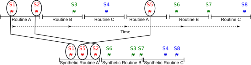
After moving every sample into the synthetic region, we can consider that the order of the samples within the synthetic region reflects the actual evolution. Thus in the example we have shown, the samples S1, S2 and S5 are reordered within the synthetic region for Routine A and the new order is S1, S5 and S2. By using the information that each sample carries (performance counters and callstack), we can elaborate a plot that shows the actual progression of the performance metrics. For instance, if we analyze the evolution of a performance counter we will obtain something like in the following figure. This figure represents the evolution for one region of the CGPOP application of the performance counter that tackles the executed instructions.
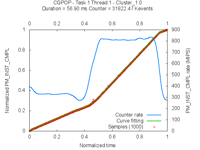
In this plot, the red crosses refer to the performance metric of the folded samples, and the blue line refers to the counter rate (i.e. MIPS). We can observe three different execution modes in the region, first which goes from 0% to 40% of the region the application runs at 300 MIPS, then the application speeds up to 800 MIPS from 40% to 90% of the execution, to finally go back again to 300 MIPS from 90% till the end of the execution.
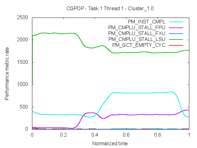
Although this plot is useful to determine whether a region has a good performance and also to detect if its behavior is steady across the execution, it cannot tell what is the reason of any performance inefficiency. It is possible to merge multiple plots that show performance counter rates in order to determine if there is any correlation between performance counters. The next figure shows, for the same execution of CGPOP as seen in the previous figure, the counter rate of three different Power performance counters. From this plot we can observe that the region that shows worst MIPS rate is also the region where the Load Store Unit (LSU, in green) is stalled most of the time. In the best region in terms of MIPS, the number of stall cycles in the LSU decreases, but the number of FP stalls increases.
To simplify the analysis of the latter plot, we can take advantage of available Cycles Per Instruction (CPI) performance models (for Power5 and Power7, for instance). Such models breakdown the CPI metric into different architectural components in order to facilitate the attribution of the component that is responsible for the application efficiency. We show in the next figure the result of using the Power5 CPIStack model for the same region of the CGPOP application. On the left axis we show the achieved CPI and on the right axis we show the achieved MIPS. The CPI is stacked in different architectural components (13) that are stacked so as to sump up for the total CPI, and the MIPS are shown through the black line that crosses the plot. We observe that the first region presents a performance problem due to the LSU (either for rejecting Load/Store instructions or for D-cache misses). The end of this region shows an increase of the FP instructions and also of the TLB misses. The second region shows that LS stalls and FP stalls are the main contributors to the overall CPI.
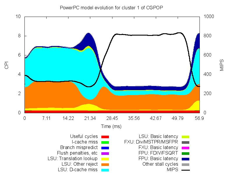
To simplify the analysis of the latter plot, we can take advantage of available Cycles Per Instruction (CPI) performance models (for Power5 and Power7, for instance). Such models breakdown the CPI metric into different architectural components in order to facilitate the attribution of the component that is responsible for the application efficiency. We show in the next figure the result of using the Power5 CPIStack model for the same region of the CGPOP application. On the left axis we show the achieved CPI and on the right axis we show the achieved MIPS. The CPI is stacked in different architectural components (13) that are stacked so as to sump up for the total CPI, and the MIPS are shown through the black line that crosses the plot. We observe that the first region presents a performance problem due to the LSU (either for rejecting Load/Store instructions or for D-cache misses). The end of this region shows an increase of the FP instructions and also of the TLB misses. The second region shows that LS stalls and FP stalls are the main contributors to the overall CPI.
We are currently working on improving the location of the performance inefficiencies within the application source code and also providing additional performance models to better understand other architectures.